
When I was in college in the early ’90s, David Carson was king. I loved all the distressed and deconstructed type coming out of his shop. It felt modern and new and hard-edged. Computer design was really coming into its own and the ability to cobble together type faces and experiment with letter, word, and line spacing was where all of the cool kids were playing. I loved it but I kinda didn’t get it, even as I knew it was the edgiest thing happening.
I was bogged down in Design Basics. I have the lovely third edition. The current edition for this book is the ninth one and it clocks in at $148.70 on Amazon. I paid $35.25 for my copy and I remember it nearly breaking my budget that semester.
I have to wonder what’s changed in Design Basics in the intervening years. Basics should be basics no matter the decade, so maybe just the illustrations have changed. I know what I learned from Design Basics is still just as relevant to me now as it was when I was trying to figure out what David Carson was doing and why he got to break all of those rules.
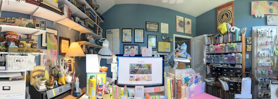
Design Basics lists twelve principles of design in its table of contents. Five of them I use every single day and I consider them the foundations of how I make art. Three of them I use most days, or they figure into my thinking of how I might solve a problem artistically. The final four don’t usually figure into what I make much at all, or at least, I maybe don’t think of them in the terms the book uses. I’m using examples from my recent journals to illustrate these design elements. Hey, it’s my blog! I totally get to do that!
Here’s my big five:
Color

Color is listed last in the book and yet it is often where I start. When I first started Make Something Every Day I was fairly limited in my use of color. I like my blues and my greens especially. It’s only been in the past year that I’ve deliberately started working on making my color schemes more varied. It’s something that doesn’t come naturally to me, so I have to be really intentional or my default is twelve shades of blue and green.
Balance

The book breaks this down into symmetrical balance and asymmetrical balance. On one of the asymmetrical balance pages I have a giant “NO” written in blue highlighter. I don’t remember what I was so opposed to since asymmetrical balance is pretty much how I build most things, but maybe it offended my 20-year-old sensibilities. Who knows. Collage work especially makes me think about balance. Where to place things. How they look visually appealing. How they look “right.” This is a skill that I’ve most definitely honed over time. Looking back on work even from just a year ago, I can tell where I would have placed things differently to make it more balanced. Some days I finish gluing things down and step back and think, “that part should have been over there to the left a bit.”
Texture

Again, another place collage always has me thinking about this. Patterns on the paper, more scribbles, another layer, a pealed off paint layer. Texture is visually interesting. I’m most definitely of the “more is more” school of thought here.
Scale/Proportion

This is one I use all the time even as how I use it changes all of the time. I find that every time I switch sizes of projects, I have to relearn scale and proportion. It took me 50 artist trading cards to figure out how it works for that size. After that, it took me 50 postcards to figure out scale and proportion for that size. Moving to different sized art journals–yep, you guessed it, learning it again. All the time I am conscious that scale is a constantly fluctuating variable for me.
Rhythm

Repeating squiggles. Repeating shapes. Repeating colors. Repeating lines. What can I repeat? What can I call out as rhythmic? How can I repeat an element to make it visually interesting? I love rhythm in a work.
The middle three:
Unity

What creates visual harmony? Unity is one of those things that you know it when you see it. I think in terms of balance more than unity, but in my mind they are clumped together in one mix. There won’t be balance without some sort of unity.
Emphasis/Focal Point

After thinking more about it, I think I probably create a focal point more often than I realized. My compositions are often zeroed in on one image or shape. It’s funny going back and reviewing some of these that I don’t think about every day and thinking about them in the context of things I am making now.
Line

Since so much of my work is collage, the prospect of line as it’s used in drawing or painting isn’t as much of an issue for me. I will go back and add lines in when I feel a piece needs more of something and the graphic punch of a pencil or marker line will deliver that. Some of my favorite line makers are Jane Davies and Nullsie.
The bottom four:
Shape/Volume and Illusion of Space and Illusion of Motion
So these three speak less to me because I am not drawing or painting specific items from nature. I found it nearly impossible to illustrate them from my work. Clearly, there are artists who use them though. I think of Giacometti and his distorted body shapes that are both graceful and eerie. I think of Andrew Wyeth and Christina’s World for the Illusion of that spacious field. For Illusion of Motion I always think of Marcel Duchamp’s Nude Descending a Staircase.
Value
I don’t work in black and white so value is rarely a thing for me. I also think it’s interesting that all of the examples the book uses for value are color images they’ve reproduced in black and white. Huh.
I get it now. I get what David Carson was doing. He’d learned all of the rules, soaked up all of Design Basics and then he struck out on his own road. Reshaping what the basics could look like with the modern conveniences of computer-generated type. I guess that’s what we are all trying to do: master the basics so we can break the rules.
What are your favorite design rules and which are your favorite ones to break? I find it endlessly fascinating how we all key in on different things and are excited by different techniques. Tag me in your Instagram posts so I’ll be sure and see them!

