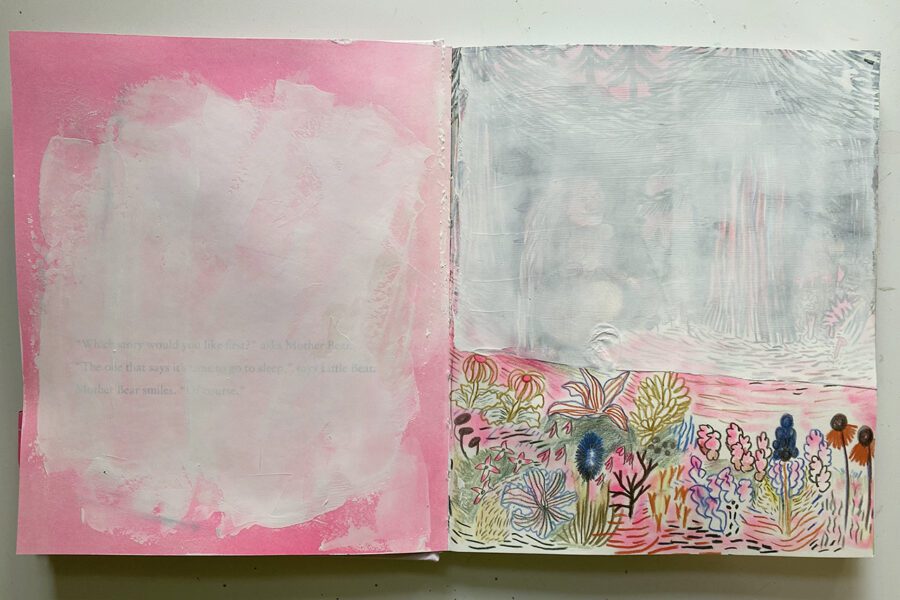
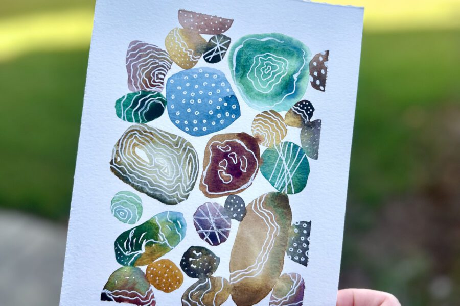
Color bars and registration marks hold magical properties for me. I wax ever so slightly poetic about how I use them and enjoy them in this post.

Color bars and registration marks
I started using the program Pagemaker on the Mac in high school for the yearbook. I graduated in 1991 so the fact that my high school had three Macs was a big deal. At the bottom of every page we printed where these tidy blocks of color and this grouping of lines. These color bars and registration marks were my introduction to press printing.
What are color bars and registration marks?
In press printing, registration marks and color bars are used to make sure the press is printing optimally across the entire sheet of paper and sometimes that sheet of paper is pretty big. Those boxes of color are a proofing tool. They assist the printer, the designer, and the client in understanding that the colors are printing accurately and at the right saturation. All the lines are to insure that everything is lining up properly. A misaligned press can cause all kinds of wonky effects, making the images look blurry, fuzzy, and/or impossible to read.

Lurking underneath
If you open up nearly any packaging, under the glued edge there’s usually a color bar lurking. It probably doesn’t come as much of a surprise to know that I love color bars. Those bars are just pure magic to me. They provide me with inspiration and collage fodder all at the same time. The marks remind me of my own history and open the door for future creativity. That’s kinda amazing given that most folks don’t even know they are surrounded by these marks.
These marks offer me…
They invite me to think of the people who conceived the box. It might be pop-tarts or pasta but one of my fellow graphic designers sat down somewhere and worked to make that packaging as useful as possible. Maybe it’s the blandest, most utilitarian thing but the packaging still lets you know what it is and what it’s made of. So much of my work at the ad agency was drudgery that I think of this compatriot designer with much respect and not a small slice of sympathy because I know they likely worked by committee and that can be exhausting.

They invite me to think about how I use color. I tend to kick it old-school neat. In my work, my colors stay separate and saturated. Out of the tub is the way I use them. I don’t tend to mix color because I love what is already there. I like intense color so I struggle with muting them. Those color blocks satisfy my need for intensity.
They are orderly. While it can be hard to tell from the artwork I make, I am a bit of a neatnik. I like things put in their place. I like a tidy workspace, a tidy house, a tidy mind. It allows me to be more freeform in other areas. The order of those little squares are soothing to me.

What do I do with them?
I cut out and keep them especially if they are an unusual color set. Occasionally, there will be one with an additional color on it that isn’t cyan, magenta, yellow, or black. These are like finding the golden ticket because they are kinda rare. I’ve always got my eye out for a purple or orange or brown or green. We recycle packaging so I regularly break down boxes at my house. It takes 30 seconds to rip off the color key from a box.
My first altered book (the pictures in this post) is full of them. When they are cut out, they are super easy to use in a grid or as a boarder. 2016-2017 Misty was clearly gaga over them. (If you’d like to see a full flip through of that journal it’s on my youtube channel here.)
This past week, I came across this one in one of my paper bins:

And it made me remember why I love these little bits so much.
These color marks are rife with possibility to me. Because they are on every single piece of printed material, they literally help compose our lives. How is that not magical? I struggle to think of something more ubiquitous while at the same time offering up so much possibility.


